See What You Get

Walk through a completed Priceography analysis from a real studio. This is exactly what your dashboard looks like after your families complete the survey.

Data shown is from a sample studio with identifying details removed.

The Recommendation

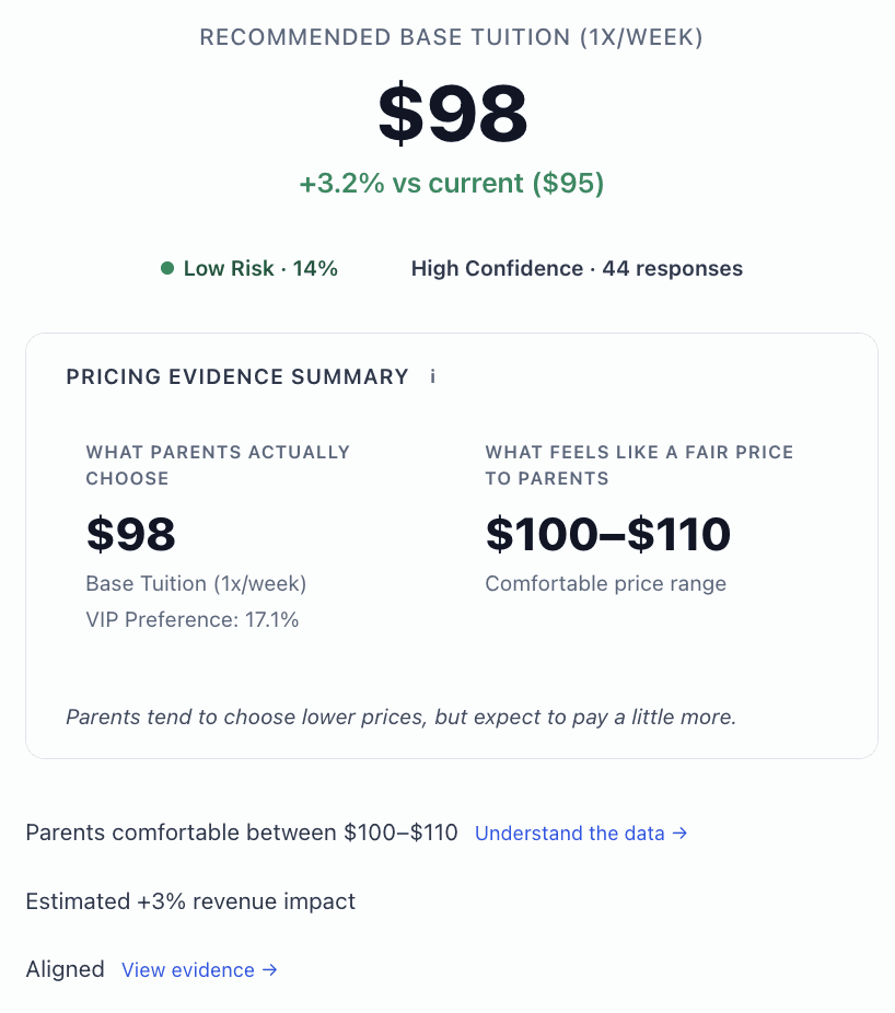
Priceography analyzes your survey responses and delivers a specific tuition recommendation with a confidence score and risk level. You see what parents actually choose and what they consider a fair price, so you know exactly how much room you have.

Sample data Priceography pricing recommendation showing $98 with Low Risk and High Confidence badges
Price Sensitivity Map

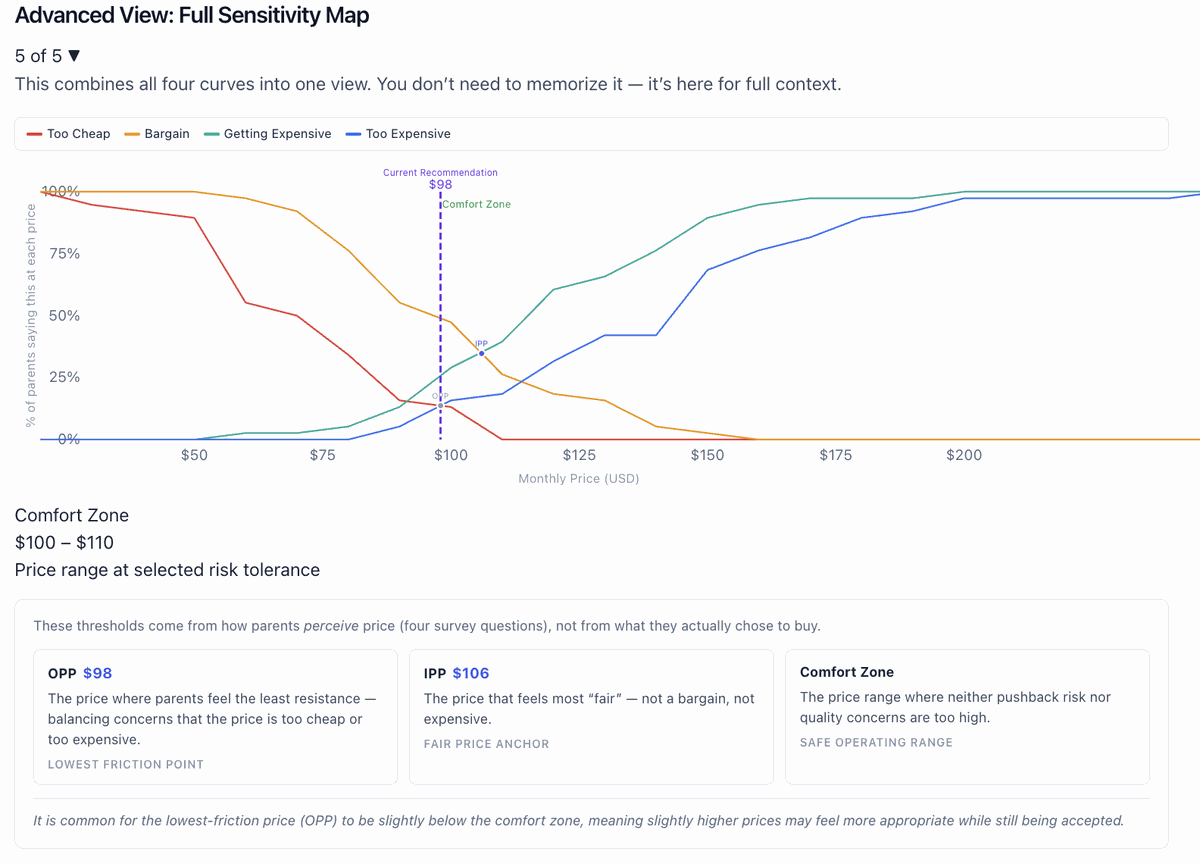
The sensitivity map shows where your parents start to feel the price is too cheap, a bargain, getting expensive, or too expensive. The Comfort Zone highlights the safe operating range where neither pushback risk nor quality concerns are too high.

Sample data Van Westendorp price sensitivity chart with OPP, IPP, and Comfort Zone

What Families Value

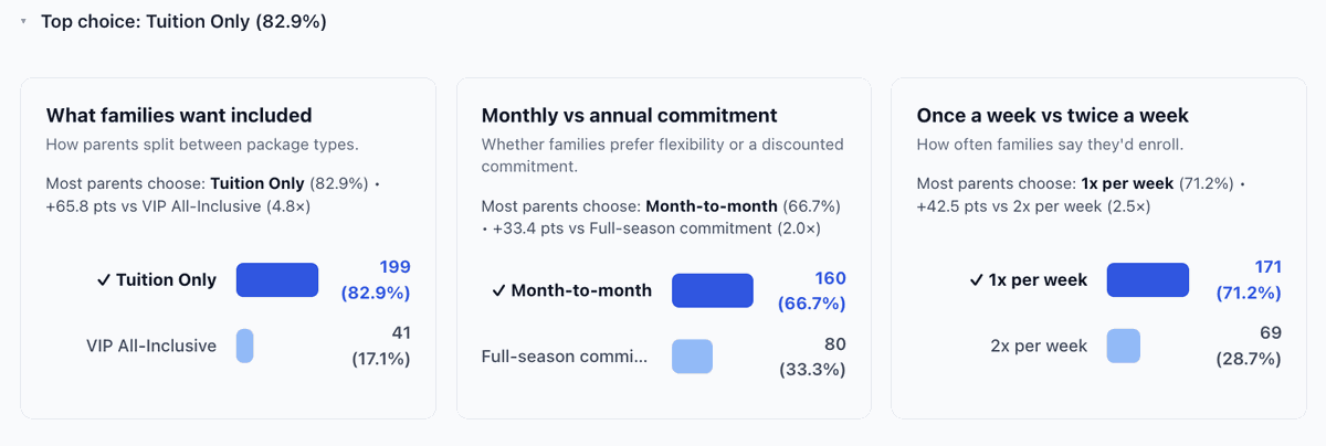
See how your parents split between package types, monthly vs. annual commitment, and class frequency. These aren't opinions from a focus group. They're revealed preferences from real tradeoff decisions.

Sample data Three evidence cards showing package type, commitment, and frequency preferences

AI Pricing Debate

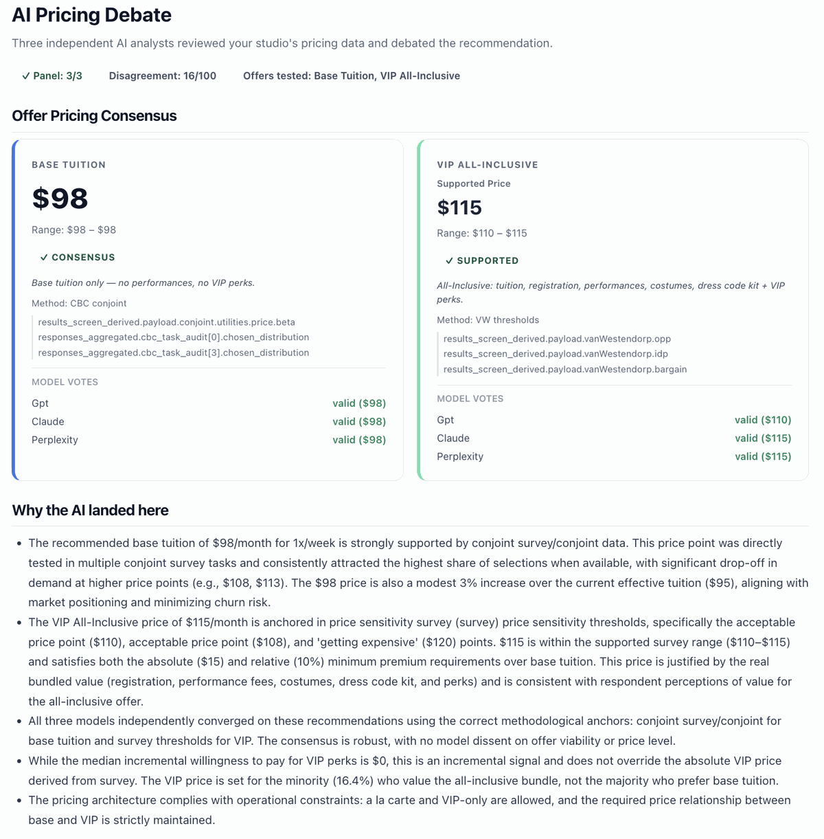
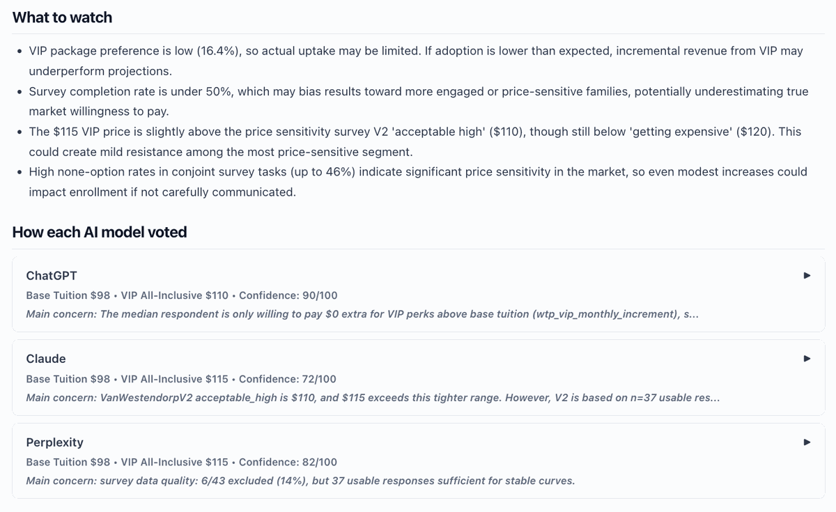
Three independent AI models (GPT, Claude, and Perplexity) each review your data separately, arrive at a recommendation, and explain their reasoning. You see where they agree, where they disagree, and why. This isn't one algorithm giving you a number. It's a structured debate grounded in your evidence.

Sample data AI Pricing Debate panel showing consensus cards and individual model votes

Interactive Simulator

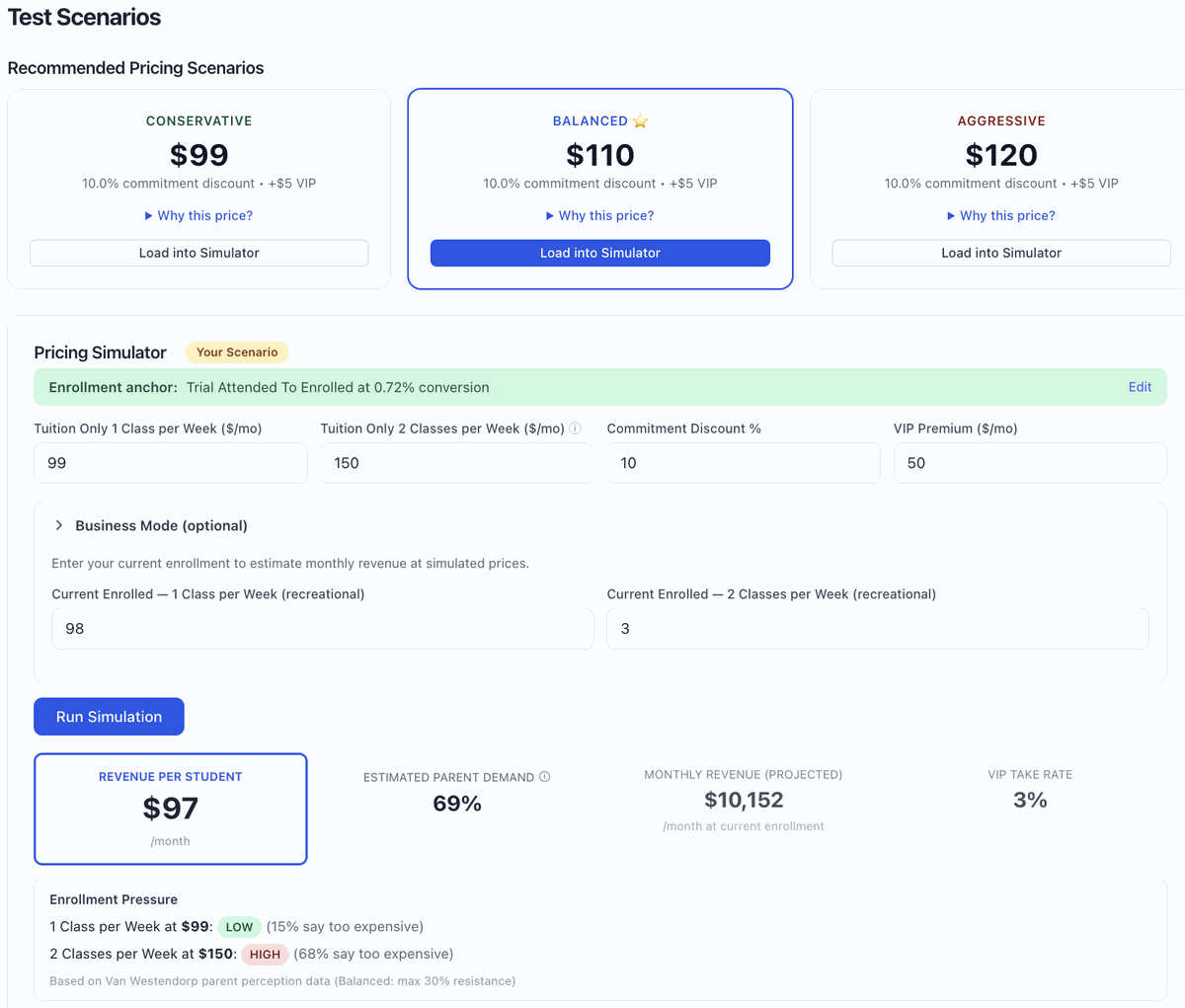
Load a conservative, balanced, or aggressive scenario, or build your own. Adjust tuition, VIP pricing, commitment discounts, and class frequency. The simulator instantly shows you modeled enrollment share, revenue per student, monthly revenue, and enrollment pressure at each price point.

Sample data Simulator showing scenario cards and tuition input fields
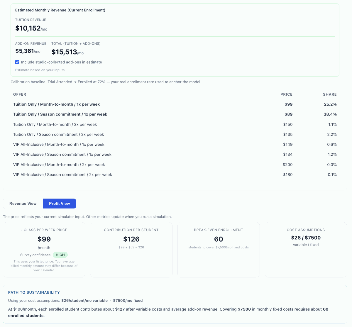
Sample data Simulator revenue output table across price points

Profit View

Toggle to Profit View and enter your cost assumptions. See contribution per student, break-even enrollment, and your path to sustainability at any price point.

Sample data Profit view with break-even enrollment and path to sustainability

Season Forecast

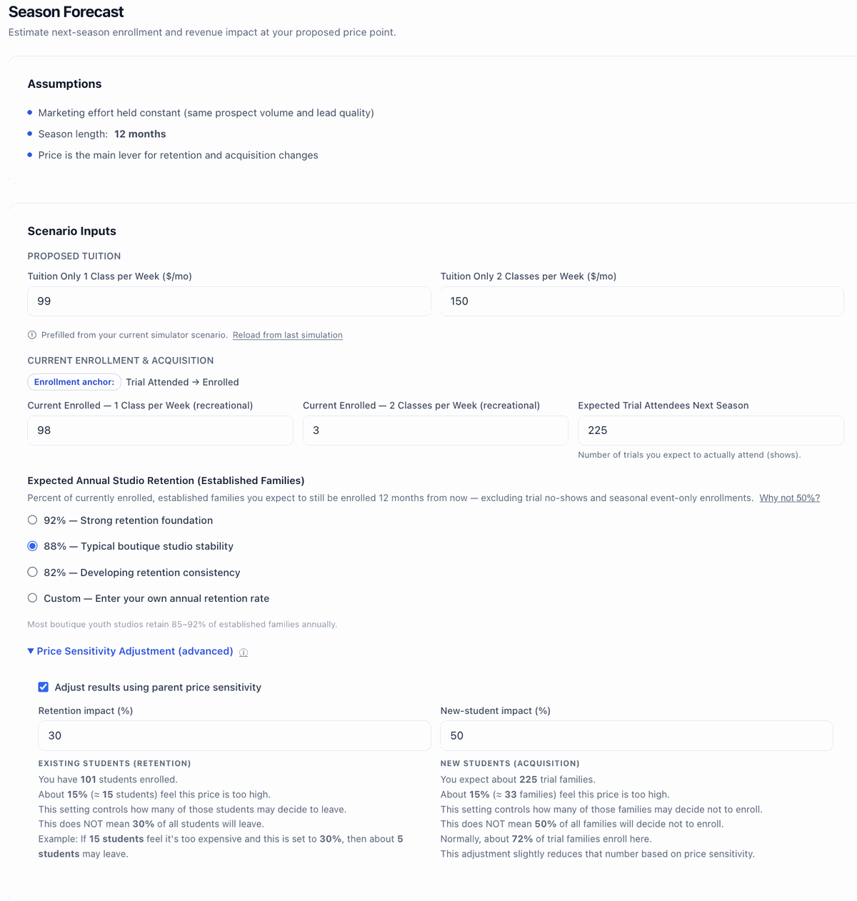
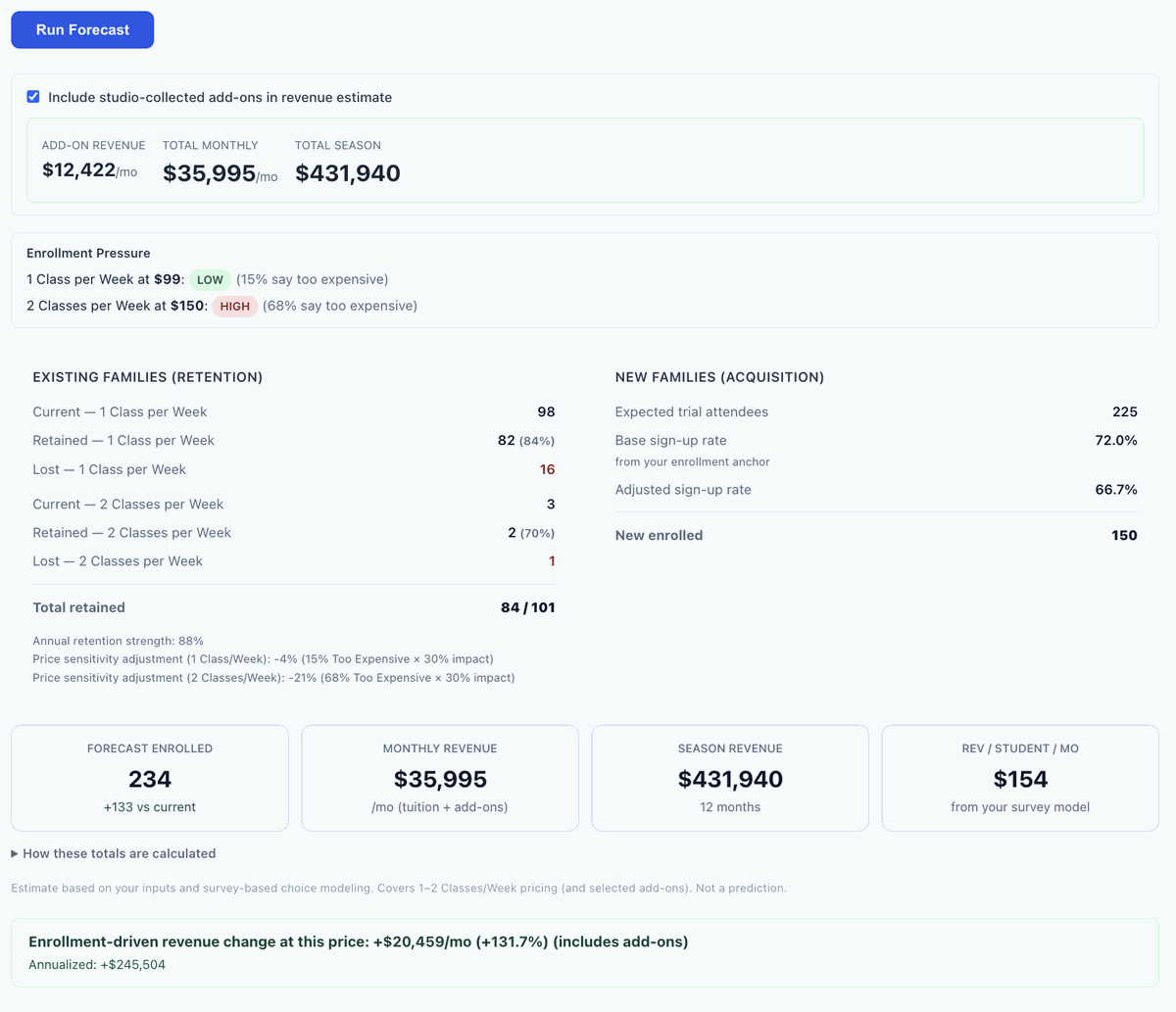
Enter your current enrollment, expected trial attendees, and retention assumptions. Priceography models your full-season enrollment and revenue, broken out by retained families and new acquisitions, with price sensitivity adjustments built in.

Sample data Season Forecast input fields for enrollment, trials, and retention
Sample data Season Forecast results with retained family and new acquisition breakdown

Ready to see your own numbers?

Your complete analysis: $1,425. Survey, simulator, AI-supported analysis, and season forecast included.